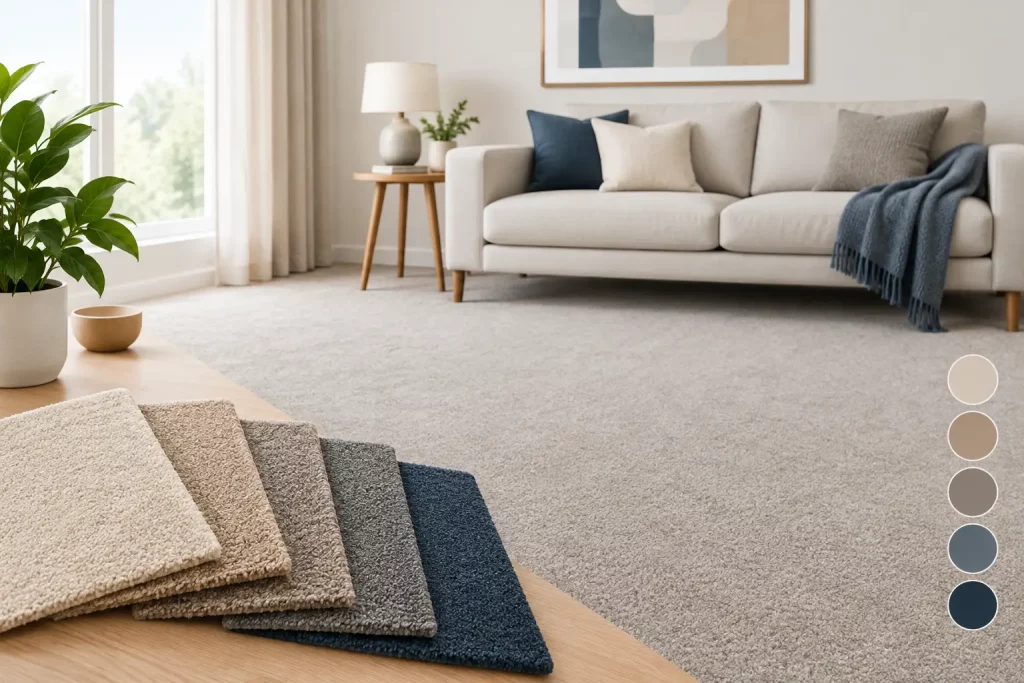
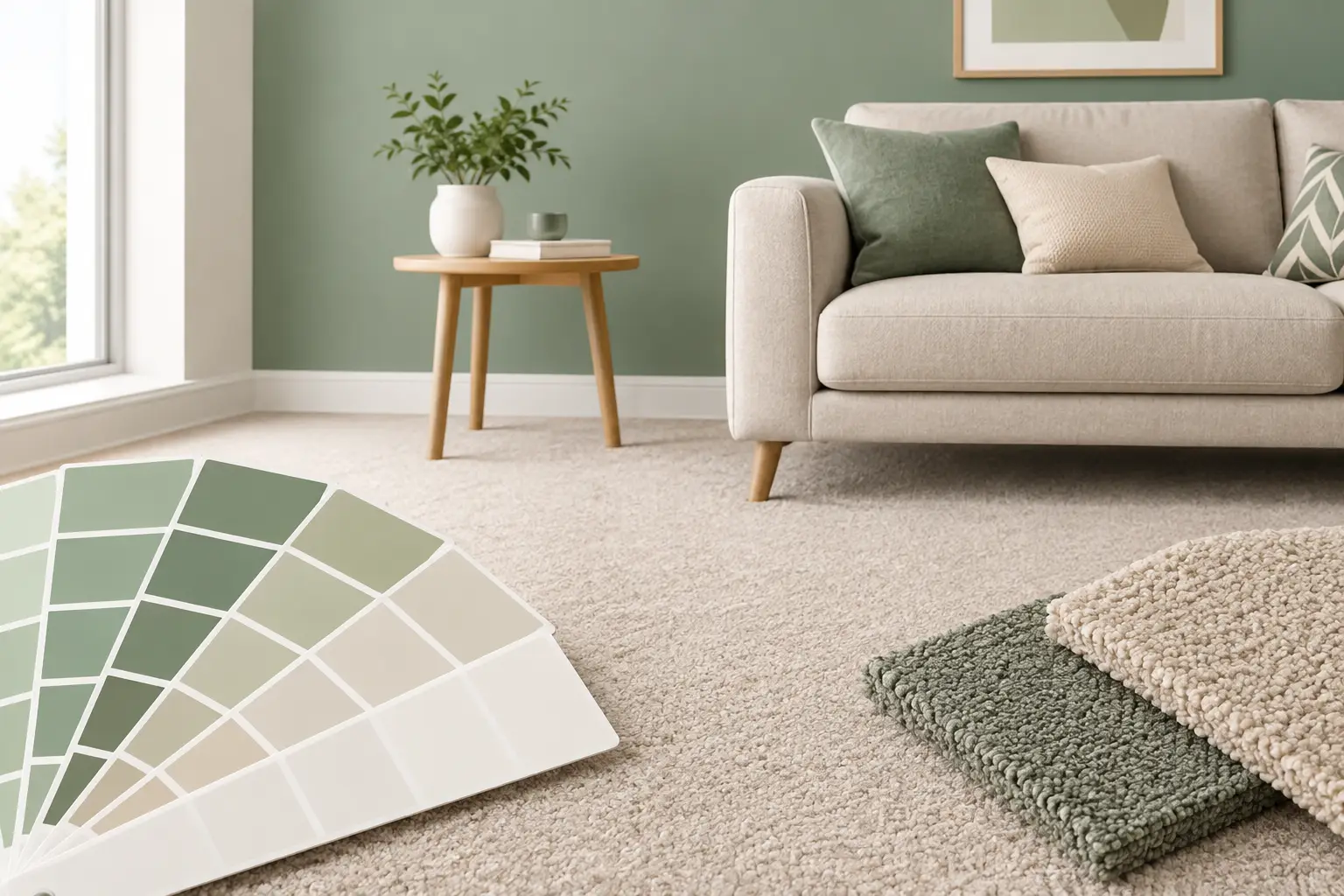
A carpet can occupy more visual space than any painted wall, particularly in a bedroom, lounge or staircase. That is why learning how to colour match carpet to paint is not simply a matter of finding two shades with similar names. The right pairing depends on undertone, natural light, texture and the atmosphere you want the room to hold from morning through to evening.
For a considered, luxurious finish, treat carpet and paint as part of one scheme from the outset. A bespoke carpet gives you far more control than a standard off-the-roll choice, allowing the floor to support the wall colour precisely rather than forcing compromises around a limited retail palette.
Start with the room’s undertone
Every neutral has an undertone. A grey paint may lean blue, green, violet or warm brown; an ivory can appear yellow, pink or grey beside another surface. This is often where an apparently sensible carpet choice goes wrong. Two colours may both be described as taupe, stone or soft grey, yet clash because one is cool and the other is warm.
Look at the paint card alongside a large carpet sample, not just a small cutting. Place them flat against the wall and view them together rather than holding them in the middle of the room. The floor and wall will influence one another, and the change is especially noticeable with pale colours.
A useful starting point is to decide whether the room is warm or cool. Warm paint colours usually sit comfortably with carpets carrying honey, biscuit, mushroom, putty or gentle brown undertones. Cooler schemes tend to suit silvered greys, blue-greys, soft charcoal and greige shades with little yellow. This is guidance rather than a fixed rule. A warm wool carpet can be an excellent counterpoint to a cool wall colour when the aim is a softer, more layered interior, but the contrast should be deliberate.
How to colour match carpet to paint without making the room flat
Matching does not mean choosing the identical colour. In fact, wall-to-wall carpet in exactly the same shade as the paint can make a room feel flat, especially where the room has limited daylight. Aim for a relationship between colours instead: similar undertones, with enough difference in depth to define the floor and walls separately.
In most homes, the carpet works best one or two tones deeper than the wall paint. Soft off-white walls with a pale oat, stone or light taupe carpet feel calm without looking clinical. Mid-grey or muted green walls often benefit from a warmer neutral carpet that stops the scheme becoming cold. Deep painted walls, such as navy, forest green or charcoal, can carry a lighter carpet for contrast, or a richer coordinating tone for a more enveloping result.
Texture changes the perceived colour too. Deep-pile velvet has a smooth, luxurious surface that catches light differently as you walk across it, which can make the shade appear lighter or darker from different directions. A deep-pile 80/20 wool-nylon twist has more visible texture and a practical resilience that suits hardworking family rooms, halls and stairs. Neither construction is automatically better for colour matching, but both need viewing in the room before a final decision.
Use contrast with purpose
A dark carpet against pale walls grounds a large room and gives furniture a strong setting. It can also make a narrow room feel smaller if there is very little light. Conversely, a pale carpet enlarges the apparent footprint of a space but will show more dirt in entrance areas and homes with pets or young children.
For many premium renovations, a mid-tone wool carpet is the most forgiving choice. It has enough depth to look substantial, masks day-to-day marks better than a very pale floor, and provides a polished base for changing paint colours in years to come. If the walls are the feature, keep the carpet quieter. If the floor is to lead the scheme, use a more restrained paint colour and let the carpet’s texture, border or tailored dimensions do the work.
Test samples in the light that matters
Paint and carpet can look entirely different under a showroom light, in a north-facing room and under warm evening lamps. This is why samples should never be approved from a photograph or a single quick viewing.
Place your chosen paint sample or painted board beside the carpet sample in the intended room. Check it in daylight, at dusk and with the lamps you use most often. North-facing rooms tend to pull out cool undertones, so a carpet that looks neutral elsewhere may appear distinctly blue-grey. South-facing rooms receive warmer light and can make cream, beige and honey tones look stronger.
Also view samples beside key fixed elements: timber flooring in an adjoining room, curtain fabric, upholstery, cabinetry, fireplace stone and skirting boards. A carpet does not need to match every finish, but it should not fight with the dominant ones. This step is particularly valuable in open-plan homes, where the carpeted area must transition naturally into kitchens, hallways or living spaces with different surfaces.
Decide what should lead the scheme
If you have already fallen for a particular paint colour, start there and select a carpet to complement it. If you are commissioning a new rug, border or luxurious fitted carpet as the main design feature, reverse the process and choose paint once the flooring colour is settled.
This order matters because paint is relatively straightforward to alter later. Bespoke carpet is made for your dimensions and chosen specification, so it deserves more time at the sampling stage. A custom-made floor also removes the pressure to accept an almost-right colour merely because it is available in a standard width.
At Colourmatched Custom Carpets, we can colour match from more than 3,000 options and make carpets to plan, including widths up to 35 feet. That gives homeowners and interior designers the freedom to choose the right shade and scale for the room, while avoiding unnecessary joins and waste associated with buying from a roll.
Consider borders and transitions
A bordered carpet or rug can bring together paint, flooring and furnishings without making the main carpet colour too busy. For example, a warm grey centre with a darker charcoal border can relate to painted joinery, while the centre keeps the room light. In a bedroom, a subtle border may echo the colour of curtains or a headboard rather than the wall itself.
Doorways and adjoining rooms need equal attention. You do not need every carpeted room to be the same colour, but the transition should look intentional. Keeping a shared undertone or repeating one border shade can create continuity as you move through the house.
Avoid these common colour-matching mistakes
The first is choosing a carpet from memory after selecting paint in a shop. Colour recall is unreliable, and both materials react to light. Take samples home.
The second is relying on colour names. Terms such as cream, natural, linen and silver are useful starting points, not technical descriptions. Always compare the actual material.
The third is choosing only for appearance and overlooking practical use. A beautiful pale velvet may be ideal for a formal bedroom but less suitable for a busy hallway. Wool is naturally resilient and has a luxurious feel underfoot, yet the room’s traffic, cleaning routine and household all deserve consideration.
Finally, do not overlook fitting and proportions. A beautifully matched carpet loses impact if visible joins interrupt the room or if the layout has not been planned around doorways, hearths and architectural features. Accurate measuring, made-to-plan manufacture and professional fitting are as important to the finished effect as the shade itself.
A confident colour choice comes from seeing real samples in your own home, under your own light, with expert advice available when you need it. Take the time to compare, then choose the carpet that makes the paint look even better – and makes the whole room feel properly finished.