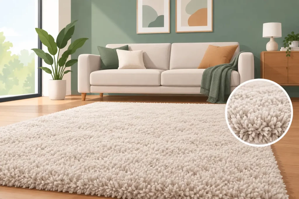
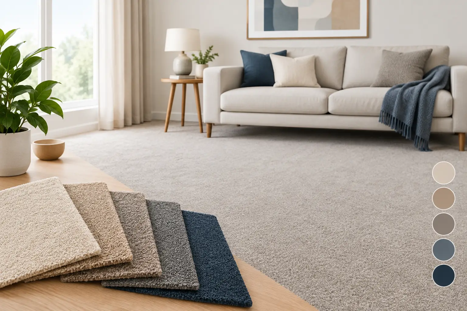
A carpet can occupy more visual space than the sofa, curtains and artwork combined. Yet it is often chosen from a small swatch after the paint, furniture and lighting have already been decided. Successful carpet colour matching takes a more considered approach: it looks at the whole room, the changing light and the finish you want to live with for years.
For a premium renovation, the aim is not simply to find a carpet that is close enough. It is to specify a floor that supports the character of the room, sits comfortably alongside every major surface and delivers the polished, continuous finish that standard off-the-roll flooring can struggle to achieve.
Why carpet colour matching changes the whole scheme
Carpet is the foundation of an interior scheme. A pale wool velvet can make a drawing room feel calm, open and refined; a deeper tone can give a large bedroom warmth and definition. Get the undertone wrong, however, and even an expensive room can feel unsettled. A beige with a pink cast may jar against stone with yellow warmth, while a cool grey can look blue beside cream-painted joinery.
This is why colour should never be judged in isolation. Walls, upholstered furniture, timber, curtains, metal finishes and natural daylight all affect the way a carpet appears. The same sample can look noticeably different in a north-facing hall, a sun-filled sitting room and under evening lamps.
A bespoke service gives you far more control than choosing from a restricted display rack. With more than 3,000 colour options available, it becomes possible to select a shade that relates precisely to your scheme rather than redesigning the scheme around the nearest available carpet.
Start with the room’s fixed elements
Before considering a carpet shade, identify the finishes that are unlikely to change. These usually include flooring in adjoining rooms, fitted cabinetry, fireplaces, stone hearths, timber joinery and large upholstered pieces. They provide the most reliable starting point because they set the underlying temperature of the room.
Look beyond the obvious colour name. Two paints described as white may have entirely different undertones: one can be chalky and cool, another soft and creamy. Likewise, oak may read honeyed, smoked or greyed, while marble may contain green, taupe or blue veining. A carpet does not need to copy these shades exactly, but it should belong in the same visual family.
For a room with warm limestone, antique brass and aged oak, a soft oatmeal, muted camel or warm stone carpet will usually feel more natural than a blue-grey neutral. In a contemporary interior with black metalwork, polished plaster and cooler whites, a silver-grey, pebble or smoky taupe may provide the cleaner result.
Where the scheme contains several strong materials, a restrained plain carpet is often the right answer. It creates a quieter field beneath patterned curtains, artwork or statement furniture, allowing the room to feel composed rather than overworked.
Carpet colour matching in natural and artificial light
Light is the detail most often overlooked. Daylight changes through the day and varies with the orientation of the property. North-facing rooms tend to emphasise cooler notes, while strong southern light can draw out yellow or warm undertones. A colour that appears balanced in a showroom may look quite different once it reaches your home.
Always assess proper carpet samples in the room where the carpet will be fitted. Place them beside skirting boards, furniture and curtain fabric, then look at them in morning light, afternoon light and after dark with your usual lamps on. Turn the sample in different directions, as pile movement can alter the depth and sheen of a deep-pile carpet.
This matters especially with pale neutrals. A warm ivory can bring softness to a dark room, but may appear too creamy beside a crisp white kitchen or contemporary painted woodwork. A cool pale grey can look elegant in good light, yet become flat in a room with limited daylight. There is no universal best neutral. The right choice depends on the light and the company it keeps.
Choose the right depth of colour
The practical demands of the room should influence the shade as much as the decorative scheme. Very pale carpet offers a luxurious, spacious appearance, particularly in bedrooms, formal sitting rooms and upper-floor landings. It does, however, show marks more readily in busy entrance areas and homes with young children or pets.
Darker colours are forgiving and can feel rich underfoot, but a very deep carpet can make a compact room feel smaller if the walls and furnishings are also dark. Mid-tones are often the most adaptable choice for family rooms, stairs and halls, concealing everyday use while retaining enough lightness to keep the room welcoming.
Texture also changes perception. A 100% pure new wool deep-pile velvet offers a particularly refined, smooth appearance, with subtle changes in shade as the pile is brushed. An 80/20 wool-nylon deep-pile twist has a more textured character and is an excellent practical choice for harder-working spaces. The colour may be the same, but the finished effect will not be identical, so samples should reflect both the chosen shade and carpet construction.
Use borders to frame the floor
A bordered carpet can solve a colour problem beautifully. Rather than forcing one shade to carry the whole room, a main field colour can be paired with a contrasting or toning border. This creates definition around the perimeter and can echo a curtain trim, painted detail, upholstery piping or a darker timber finish.
In a large reception room, a border can make the carpet feel deliberately designed rather than simply fitted wall to wall. In a bedroom, a soft tonal border can add interest without interrupting the restful quality of the scheme. The proportions need careful planning: an overly narrow contrast may look accidental, while a border that is too wide can dominate the room.
Bespoke manufacture allows the border width, placement and colours to be made to plan. It is particularly valuable in irregular spaces, around hearths and in rooms where the furniture layout needs the floor to feel visually centred.
Avoid the costly compromises of standard widths
Colour matching is only part of achieving an exceptional result. Even the best shade can lose its impact when visible joins cut across a wide room. Standard carpet widths can force unnecessary seams, especially in larger bedrooms, open-plan spaces and substantial reception rooms.
Custom manufacture up to 35 feet wide allows many rooms to be fitted in one continuous piece. The result is more refined, with uninterrupted pile direction and no obvious lines through the floor. It also avoids the waste that comes from buying a standard roll width that does not suit the room plan.
Accurate measuring is essential here. A professional survey considers not only the room dimensions, but alcoves, doorways, stair details, hearths, changes in level and the direction in which the carpet should run. This is the point at which a bespoke manufacturer can make a meaningful difference, ensuring colour, scale, borders and fitting requirements are considered together rather than as separate decisions.
Make the final decision with confidence
Do not feel pressured to select a carpet colour during an initial conversation. A luxury floor is a long-term choice, and samples should be taken seriously. Compare two or three well-considered options rather than trying to judge dozens of near-identical shades. Too much choice can obscure the difference between a good match and the right one.
At Colourmatched Custom Carpets, the process can include free measurement, design advice, a no-obligation quotation, bespoke manufacture and professional fitting throughout the UK. Underlay and fitting are included in stated square-metre prices, so the final specification can be considered without hidden extras appearing later.
The strongest carpet choice usually feels calm rather than attention-seeking. When the shade has been selected in the room, in the right light and alongside the materials that matter, the carpet will not compete with the scheme. It will make every other finish look as though it was always meant to be there.