A border can make a carpeted room feel properly planned rather than simply fitted. The best top carpet border design ideas use colour, proportion and material to define the floor, draw the eye towards key furniture and give a room the composed finish usually associated with a tailored rug.
For a hallway, stair landing, drawing room or principal bedroom, a bordered carpet offers far more freedom than a standard off-the-roll choice. The border may be quiet and tonal, confidently contrasting or selected to pick up one precise shade from fabric, paintwork or upholstery. The right approach depends on the room’s size, light levels and how formal you want it to feel.
10 top carpet border design ideas for refined interiors
1. A tonal border for understated depth
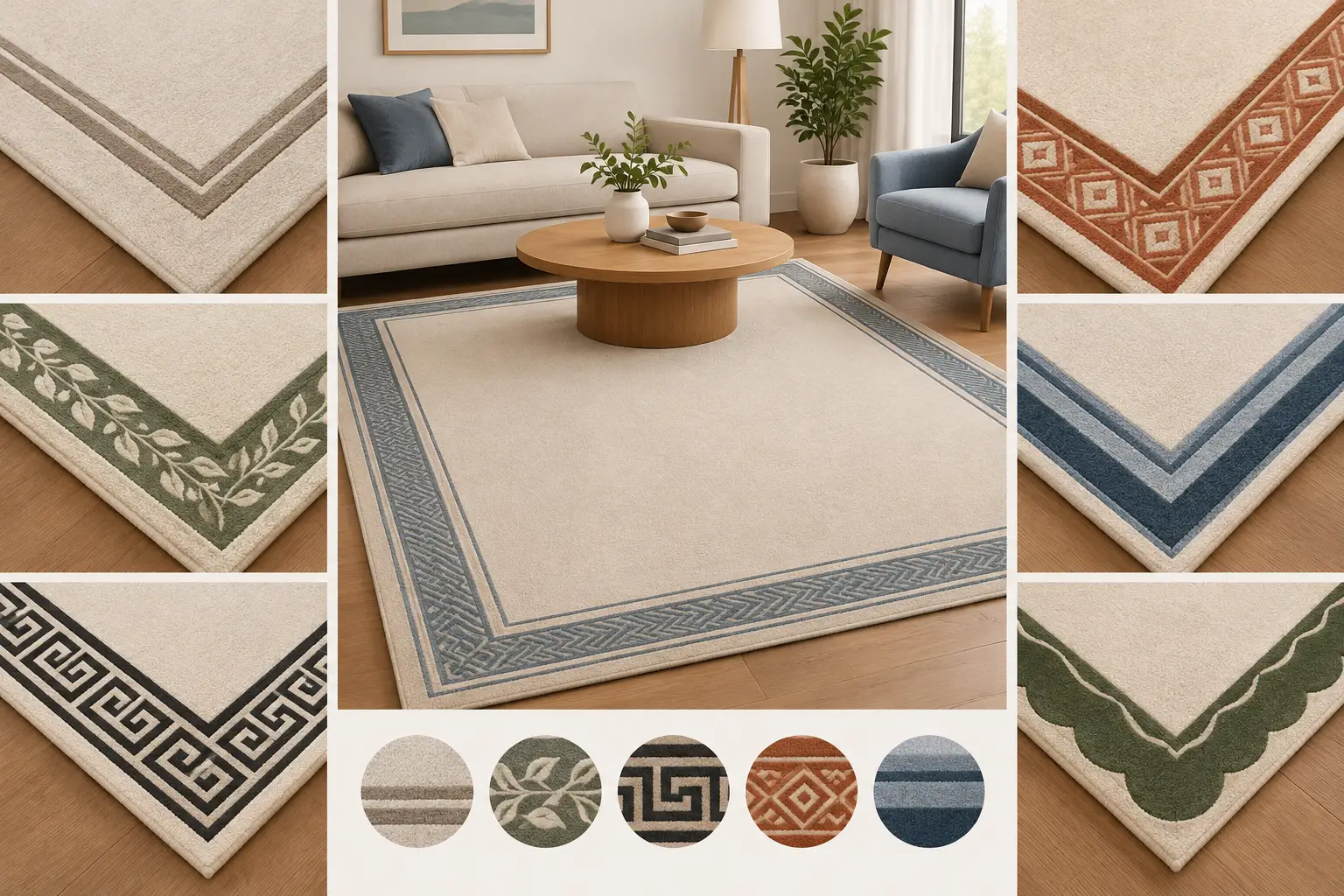
A border only one or two shades deeper than the centre is an excellent choice where the room already has strong architectural detail, patterned curtains or statement furniture. Think warm ivory framed with mushroom, pale grey with graphite, or soft stone with taupe. The effect is calm but deliberate, adding depth without breaking up the floor.
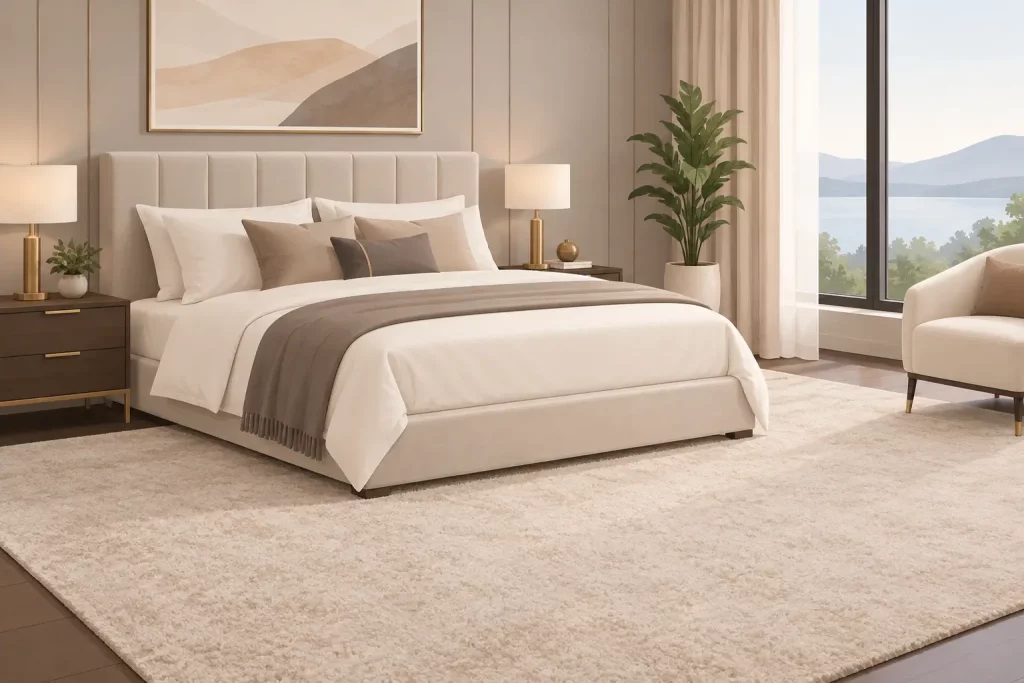
This is particularly effective in bedrooms and large living rooms, where a high-contrast edge can feel too insistent. A wool deep-pile velvet centre with a slightly darker tonal border also gives a beautifully soft, luxurious appearance underfoot.
2. A dark frame around a pale centre
A pale carpet with a dark border is one of the most enduring formal schemes. Navy, charcoal, deep forest green or rich brown can frame ivory, oatmeal and pale greige centres with real authority. It gives the room a grounded appearance and can help pale flooring feel less vulnerable in areas of regular use.
The proportion matters. A very narrow dark line reads as crisp detailing, while a wider border creates the look of a large bespoke rug fitted wall to wall. In a compact room, keep the border restrained so it does not appear to close the floor in.
3. A border matched to joinery or painted woodwork
Matching the border to skirting, panelling, shutters or a painted staircase is a thoughtful way to make the scheme feel cohesive. A muted blue-grey border can connect with painted cabinetry, while a warm green may echo a library’s woodwork or a country house boot room.
Exact matching is not always necessary. In fact, a close related shade often looks more natural than an identical one. With thousands of colour options available, a bespoke carpet can be designed around the actual paint and fabric samples rather than an approximate shade seen under showroom lighting.
4. A colour-picked border from upholstery
For sitting rooms and bedrooms, the border can be the link between the floor and the furnishing scheme. Take a secondary colour from a striped chair, patterned curtain or headboard fabric, rather than the dominant shade. This creates a connection without making the room look overly coordinated.
A muted claret border beside a neutral centre can pick up a small detail in a cushion or antique rug. Likewise, a soft sage edge can settle a room with botanical fabrics. Requesting samples before making a final choice is essential, as wool colours change character with daylight, lamp light and the direction of pile.
5. A wide border to create a fitted-rug effect
A generous border, often around 20 to 35 centimetres depending on room scale, creates the visual language of a large area rug while retaining the comfort and coverage of wall-to-wall carpet. It works especially well in reception rooms where furniture is arranged centrally, leaving a clear perimeter around the walls.
This design needs accurate measuring. The border should remain visually even around chimney breasts, bay windows and door openings where possible. A made-to-plan carpet allows the layout to be considered before manufacture, rather than trying to force a standard-width product into an awkward room.
6. A narrow pinstripe-style edge
A narrow border is a smart solution for contemporary homes, flats and smaller rooms. It adds definition but keeps the centre visually expansive. Consider a soft neutral centre framed by a fine black, dark blue or rich chocolate edge for a tailored look that works well with clean-lined furniture.
The appeal lies in restraint. If the interior is minimal, a narrow contrast can provide exactly enough interest. It is also a useful choice for corridors and landings, where a broad border may leave too little centre carpet and make the space feel crowded.
7. A warm natural palette for period homes
Period properties often suit borders inspired by natural, layered colours: flax, oat, tobacco, moss, russet and faded red. These shades sit comfortably alongside timber floors, aged brass, stone fireplaces and traditional furniture without becoming overly historical in feel.
For this type of scheme, texture is as important as colour. A deep-pile 80/20 wool-nylon twist provides resilience for busy family areas, while retaining the warmth and richness expected of a quality wool carpet. In quieter rooms, 100% pure new wool velvet brings a more formal, plush finish.
8. A soft contrast for bedrooms
Bedrooms rarely need a dramatic border to make an impression. A gentle shift, such as warm white with pale blue-grey or beige with muted blush, can give the floor a restful framed effect. The border becomes most visible when the bed does not cover it, so it is worth planning the layout around the furniture rather than choosing the carpet in isolation.
If the room has fitted wardrobes or irregular alcoves, a bespoke layout prevents the design from looking accidental. The aim is for the border to appear intentional from the doorway and at the foot of the bed, not merely to follow every interruption in the wall line.
9. A statement border for a hall or stair landing
Entrances can take more character than private rooms. A strong navy, bottle green, oxblood or black border gives a neutral hallway real presence, particularly against white walls and painted stair spindles. It also visually directs the route through the house and can create a sense of continuity between hall, landing and adjacent reception areas.
Practicality should lead the decision here. Hallways carry outdoor grit and regular foot traffic, so a resilient pile and a colour that is forgiving of daily use make good sense. Darker does not automatically mean easier to maintain, however. Very dark plain carpet can show pale dust, while mid-tones and subtle flecked effects are often more accommodating.
10. A border that mirrors the room’s architecture
The most successful bespoke borders respond to the room itself. In a square room, an even frame reinforces balance. In a long rectangular drawing room, the border can help emphasise the proportions, while a shaped plan may be needed around bays, fireplaces or built-in furniture.
There are occasions when a full perimeter border is not the best answer. A room with several doorways, a large open arch or an unusually narrow wall can benefit from a simpler design or a border that is adjusted sensitively to the layout. This is where a professional survey and design discussion avoid costly compromises later.
Choosing the right border width and carpet quality
There is no universal border measurement. As a useful starting point, smaller rooms tend to suit narrower borders, while generous reception rooms can carry wider, more decorative frames. The key is leaving sufficient centre carpet for the border to read as an edge, not as the main feature.
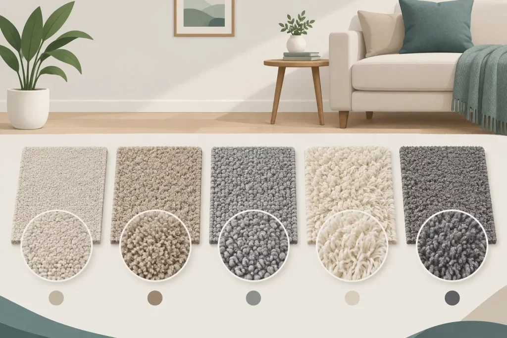
Material choice should reflect how the room is used. Pure new wool deep-pile velvet delivers pure luxury underfoot and a rich, smooth appearance for bedrooms and formal spaces. An 80/20 wool-nylon deep-pile twist is a strong choice where a more hard-wearing finish is required. Both can be specified in carefully selected centre and border colours, allowing the design to be tailored rather than restricted by stock ranges.
Width also deserves attention. Standard carpet widths can create unnecessary joins in larger rooms, and a join across a bordered design is especially distracting. Wide-width bespoke manufacture, up to 35 feet wide, can remove that issue and provide the clean, continuous floor a premium scheme requires.
From samples to fitting: getting the detail right
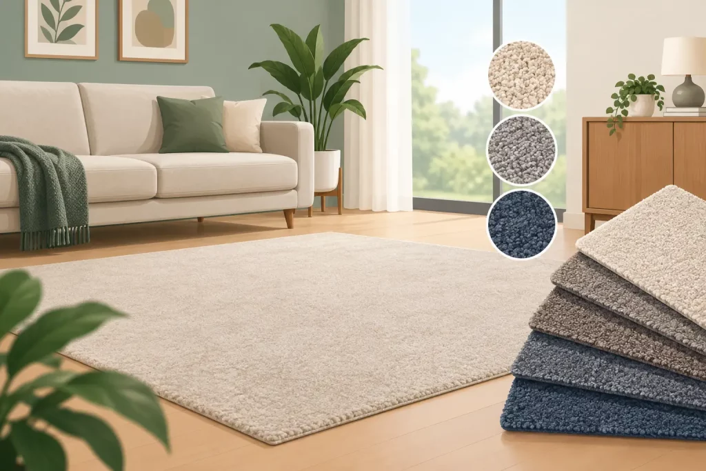
A bordered carpet should be viewed as part of the complete room, not a separate decorative decision. Compare samples alongside wall colour, curtains, flooring in neighbouring spaces and key upholstery. Look at them in morning and evening light, and place them flat on the floor rather than holding them upright.
Accurate measurement is equally important. Border widths, pile direction, door positions and transitions between rooms all need to be planned before production. Ordering a carpet made precisely to the room plan reduces offcuts and waste, while helping ensure the finished design looks balanced from the viewpoints that matter most.
Colourmatched Custom Carpets manages this process from free measurement and design advice through to manufacture, supply and professional fitting across the UK. Underlay and fitting are included in stated square-metre prices, so homeowners and designers can assess the full cost clearly rather than discovering additions later.
A well-chosen border does more than decorate the floor. It gives a room a settled, bespoke character, and with the right samples, measurements and craftsmanship behind it, it will continue to look considered long after the rest of the scheme has changed.